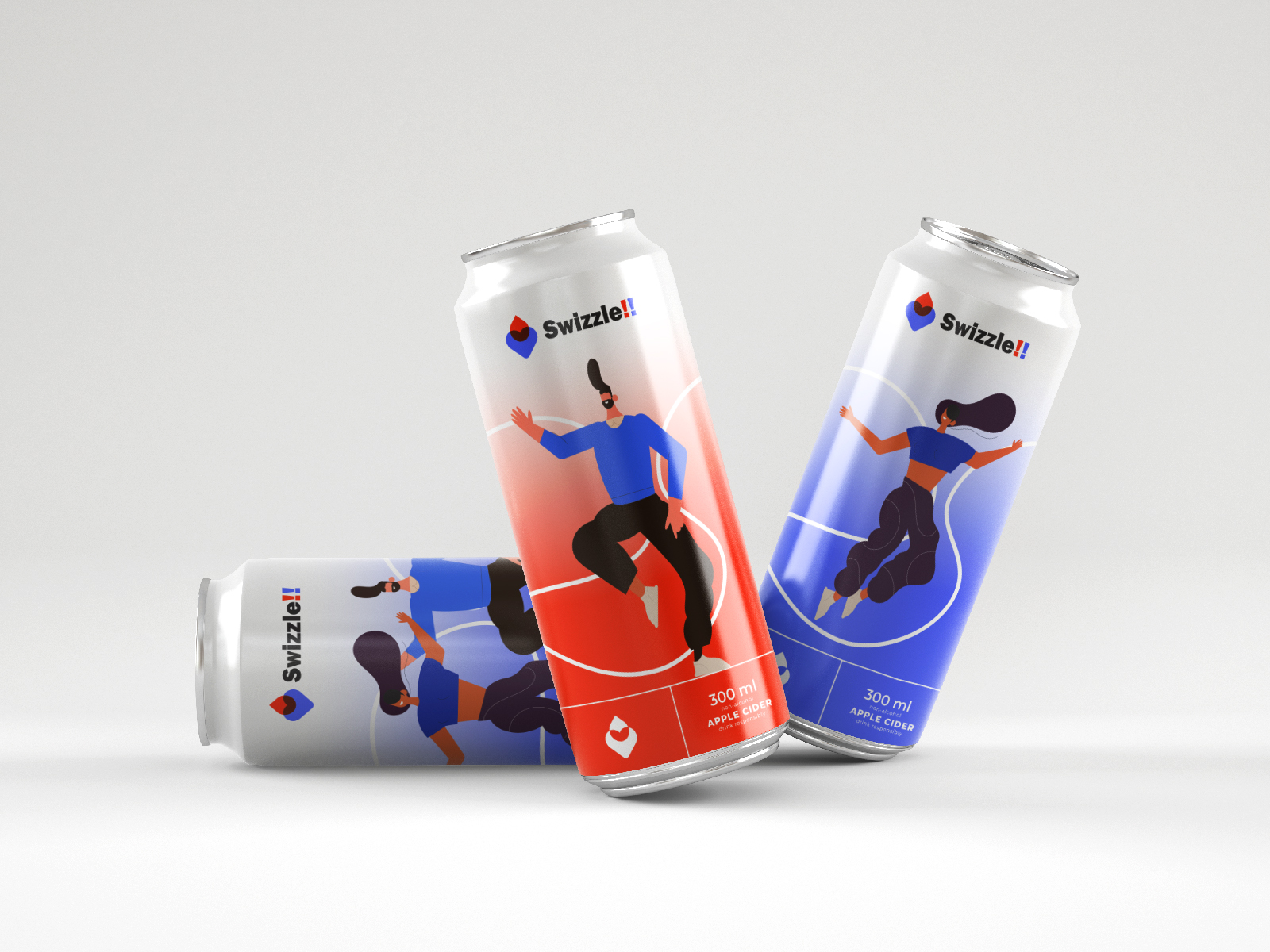
Swizzle!! brand identity is a modern beverage brand that reflects vibrancy, energy, and motion. Its branding incorporates playful yet professional design elements, targeting an active and youthful audience. This case study examines how Swizzle!!’s brand identity, as portrayed in its visual assets, stands out and creates a strong connection with its target market.
1. Logo Design: The Core Identity
The Swizzle!! logo is a bold and energetic centerpiece that defines the brand.
Features:
- Symbol: A unique geometric drop icon in blue and red, representing fluidity and refreshment.
- Typography: Bold sans-serif type for a modern and approachable feel.
- Punctuation: The double exclamation marks (!!) emphasize excitement and dynamism, aligning perfectly with the brand’s vibrant nature.
The logo’s adaptability across platforms ensures consistent recognition and recall.
2. Color Palette: Energy in Every Shade
Swizzle!! uses a striking color palette dominated by Red (#ff2b2b), Blue (#2648ff), and White (#ffffff).
- Red: Represents energy, passion, and vibrancy, aligning with the brand’s dynamic theme.
- Blue: Symbolizes trust, refreshment, and reliability.
- White: Adds balance and neutrality to the overall design.
The combination of these colors gives the brand a bold yet clean visual appeal, easily capturing attention in a crowded market.
3. Packaging Design: Functional and Eye-Catching
Can Design:
The Swizzle!! cans are an extension of the brand’s energetic personality. Featuring illustrations of dynamic characters in motion, they connect deeply with the brand’s active and youthful audience.
- Minimalistic Layout: Clean yet lively, emphasizing the bold colors and typography.
- Illustrations: Depict movement and energy, resonating with the brand’s mission to inspire action and activity.
- Branding Placement: The logo and key elements are prominently displayed for instant recognition.
Differentiation:
Each can is uniquely designed while maintaining a unified look, offering variety while preserving the core brand identity.
4. Marketing Collateral: Extending the Brand
Swizzle!!’s identity extends into various touchpoints, including stationery, digital assets, and product visuals.
- Stationery: Letterheads and envelopes reflect the logo’s clean design, making the brand appear professional and trustworthy.
- Digital Presence: The visuals are bold and optimized for online platforms, ensuring the brand communicates effectively in the digital space.
- Visual Uniformity: The cohesive use of color, typography, and illustrations ensures consistent messaging across all channels.
5. Audience Appeal: Connection Through Energy
Swizzle!!’s identity is designed to resonate with an audience that values fun, movement, and excitement.
- Target Audience: Youth and active individuals looking for a refreshing and energetic beverage.
- Key Messaging: Through its design and branding, Swizzle!! communicates a message of liveliness, fun, and energy.
6. Why Swizzle!! Succeeds
Swizzle!! stands out due to its vibrant and bold branding, which perfectly aligns with its product and target audience. The carefully crafted visuals, cohesive design elements, and attention to detail create a memorable brand identity that engages and energizes its audience.
Conclusion
Swizzle!! exemplifies how a well-thought-out brand identity can create a lasting impact. From its bold logo to its dynamic packaging, every element works harmoniously to convey the brand’s core message of energy and excitement. This case study highlights the importance of consistent and creative branding in building a strong connection with consumers.
